I don’t know if it’s ever happened to you (surely yes) that a project comes to your hands and that project has a delivery date that seems almost impossible to meet and in addition to having a short timeline, the amount of content that the project contains is exorbitant. It has happened to me…a lot of times.
In this blog post, I would like to present you with some tips on how to approach these types of projects from a documentation perspective. I’d like to explain how wireframes could become the tool that helps you meet the objectives of the project as well as the expectations of your customer, while also having a very well-documented UI/UX product ready to be shared with the development team.
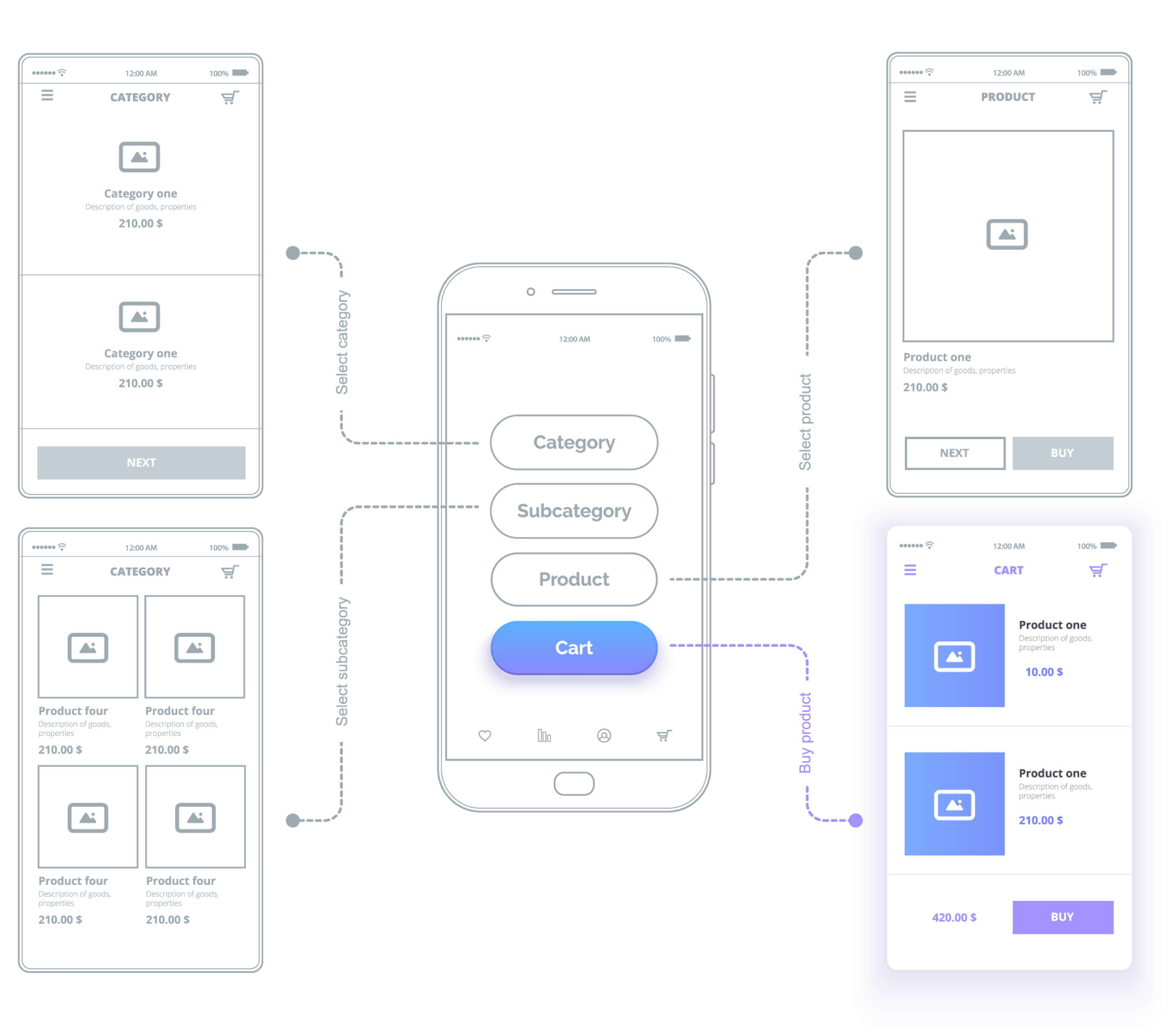
First of all, I would like to explain to you what a wireframe is, just in case you aren’t familiar with the subject. A wireframe is a tool within the discipline of UI/UX design that consists of a graphically simple 2D representation of a product, screen, concept, UX case, etc. for a user interface, without setting colors, specific shapes, final icons, etc.
Usually, UI/UX designers produce wireframes with lines and basic shapes like circles, squares, and arrows pointing to navigation, etc. Wireframes avoid having too much detail regarding graphics, colors, fonts, and icons. It is best to choose a neutral and readable font type and only use colors when necessary, such as when representing alerts (red, orange) or equipment states (off, on), for example.

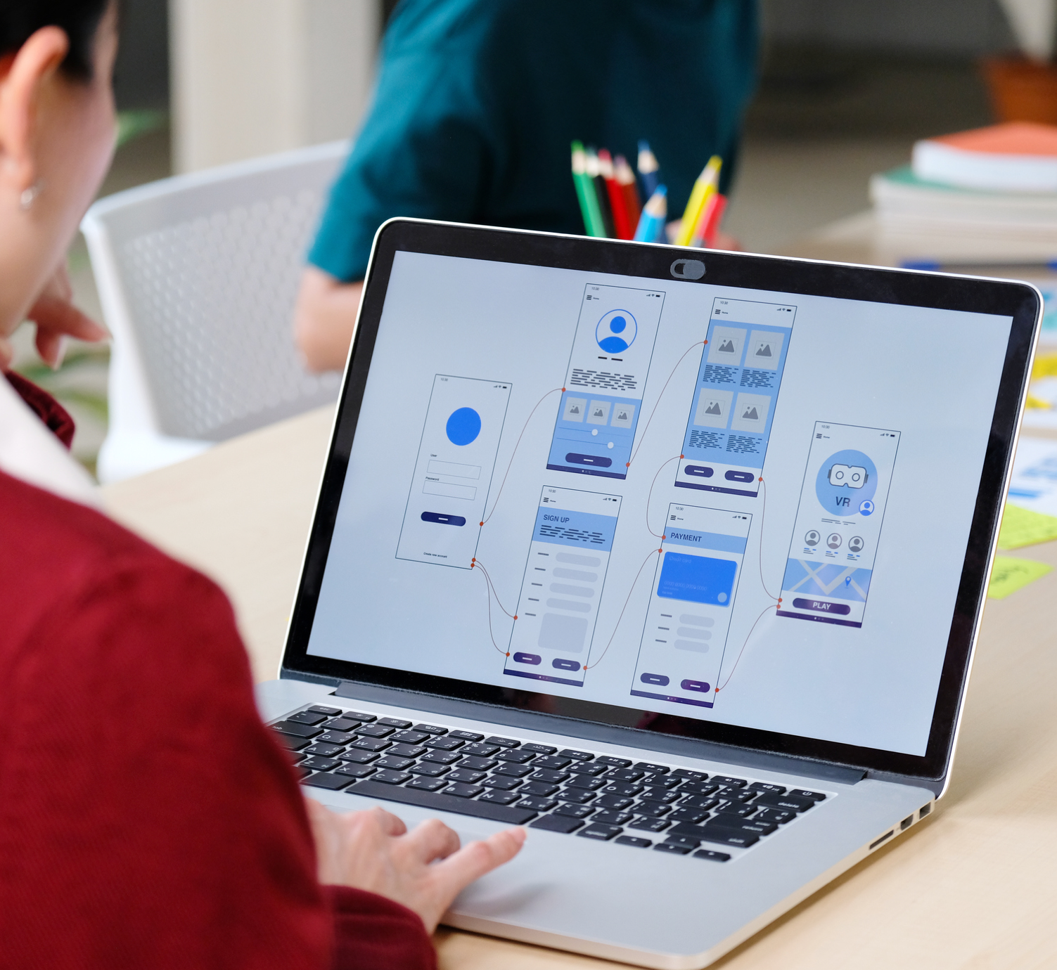
A well-executed wireframe will help you establish a navigation map and screen organization. Wireframes will also help you establish detailed content (UX writing), as well as multiple variants of UX cases, main flows, and uncommon flows that also need to be documented.
For more information about wireframes and the different types based on production, I invite you to read our blog post entitled Wireframe Concepts and Software Tools in 2020.
Types of Wireframes
To bring that seemingly impossible project to fruition, let’s explore the different types of wireframes and see which one will work best for your particular type of case.
1
Low-Fidelity Wireframes

2
High-Fidelity Wireframes

3
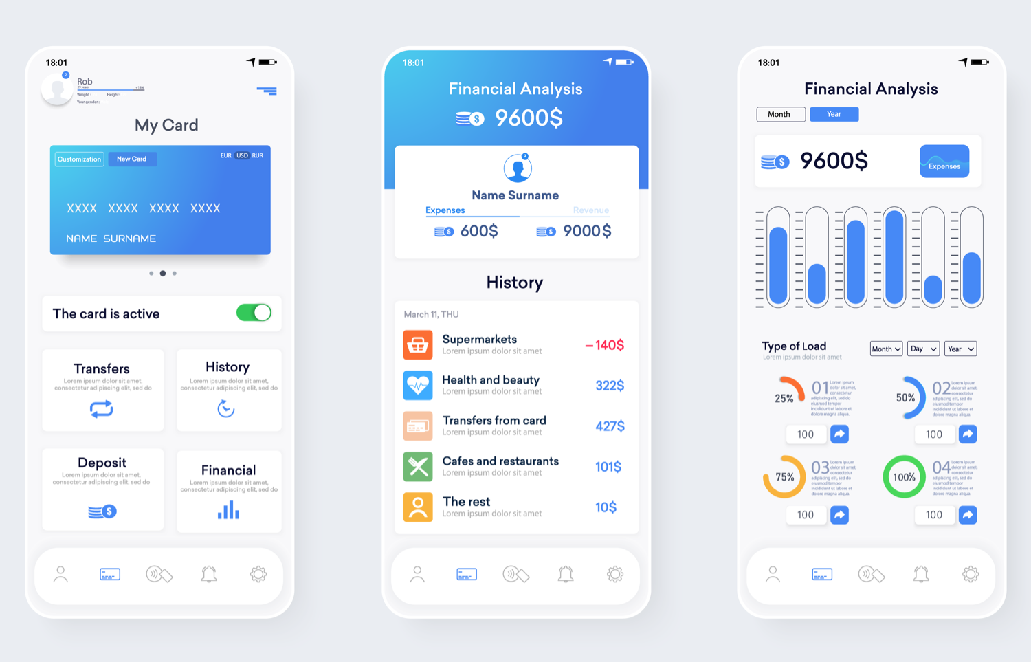
This type of wireframe is characterized by having interactivity similar to that of the final product; the interactivity works to represent more realistic navigation. You will need specific software in order to upload your wireframes and program them to behave like the final product. Interactive wireframes are limited in the sense that you will need a lot of time programming the prototype to handle each UX case interactively. This happens because we often depend on user input to navigate between different UX cases. The high-fidelity wireframes will not give you interactivity, but you can still document more UX cases more rapidly. These types of wireframes are great for early testing on real users as well as for documenting first impressions.

Now, what type of wireframe will work best for you? and, Which one will best handle this demanding project with such a short timeline? How will you decide?
It’s important to note these generalizations: Low-fidelity wireframes do not provide enough information by which to develop a product. Interactive wireframe prototypes, on the other hand, require specific software to achieve interactivity, possibly making it more difficult to create a prototype of each possible UX case that the product or app can handle. Therefore, your best tool for this case will be high-fidelity wireframes.
Benefits of High-Fidelity Wireframes
Now, why will high-fidelity wireframes become your best ally for that seemingly impossible project? Let me explain it to you right away:
High-fidelity wireframes will allow you to capture requirements in a fast, clear, and simple way—By their nature, high-fidelity wireframes will give you a 360-degree view of the requirements from an organization, navigation, reading, and content point of view (UX writing), without going into user interface details, which will allow a total approach to the user experience and save you time on graphical user interface details.
For especially technical projects, high-fidelity wireframes will allow you to detail navigation and content of different types of physical equipment that your project could support, including UX cases of failures in technology, equipment, or devices.
High-fidelity wireframes will allow you to document a wide variety of UX cases—I will exemplify this point with a familiar case in UI/UX projects: log-in and sign-ups.
Although the log-in process might seem common, simple, and universal, there are actually an endless number of possible cases, depending on what inputs the user enters. For example, we can find sign-ups requiring only email, password, and repeat password—simple and fast. But if the product requires it, we can have sign-ups that include first name, surname, address, telephone, email, password, etc.
The more fields we have, the more information validation it will be necessary to do. For example, the user may be required to enter a telephone number; this phone number will need to have the exact number of characters found in a telephone number in order to be validated as such. If the user enters an address, it will need to be valid in terms of house number, street, city, state, postal code, etc.
The input the user enters into the interface can lead to errors in the validation process, therefore altering the natural flow of the product experience. In other words, one would expect that after entering the required information, the user would be able to access the desired platform. But what happens if the user enters the wrong address or the phone number is missing a character because of a typing error?
This is where we will need different types of messages according to the UX case presented—and that is where high-fidelity wireframes will be our best ally. They will allow us to document each case and define what information we want to present to the user in case their input is not validated.
Making this type of documentation in high-fidelity mockups or interactive prototypes represents more work at the end of the day.
High-fidelity wireframes will allow you as a designer to have a positive and quick reaction to unexpected changes—As in all creative and technological processes, we are not exempt from changes related to the redefinition of requirements, both in the user experience and in the technical aspect.
In cases where the project schedule is too tight, it is most likely that requirements will change and issues develop due to the urgency of finishing the project on time. This is why it is important to be prepared and be reactive in a productive way.
A change in the design of the application interface could significantly impact documentation made with high-fidelity mockups, but from the wireframes’ point of view, the impact is minimal, if not zero. A change in navigation and the content of an application impacts both types of documentation (wireframes and mockups). However, the reaction capacity is faster in wireframes since manipulating an interface with pixel-perfect detail is not required.
As we already established, wireframes can work from the simplest form—2D, line style, without colors, etc.—to a more complex way, in the form of an interactive prototype that maintains its simplicity in lines and detail but offers interaction between screens. The speed of the reaction, of course, will be related to the format you have chosen for your wireframes.
High-fidelity wireframes will allow you to maintain detailed documentation of your project—To produce a wireframe at its best, we have to take into account that it must contain the ideal (necessary and accurate) information, so the development team has what they need to read and interpret the requirements and wireframes—and thus, be able to achieve a final product that meets the objectives of the product and is satisfactory to the client as well as the user.
The advantage of developing a high-fidelity wireframe is that due to its graphically simple nature (not being in actual screen size or pixel-perfect production), we can use the space that surrounds it to put notes or requirements that may be necessary to the development team. For example, this could include notes on transitions, which components to use, technical specifications, possible variations in navigation, etc.
Conclusion
You may not realize it, but little by little, your wireframes will become more than a design deliverable. Your clients will soon consider your wireframes a required document.
Your wireframes will be so efficient that for future releases, you will have set the standard for how to handle the documentation of new requirements and screens. You will make life easier for your client, the developers, and especially for yourself.
At the end of your project, the application or product will be so well documented that it will only be necessary to prepare a simply written style guide to be able to attack the graphical interface aspect.
If you are interested in knowing more about style guides, I invite you to read our blog post entitled Creating a UI Style Guide for Web and Mobile Apps.


I’m glad this blog post is shedding light on the importance of high-fidelity wireframes in UX documentation. As a seasoned UIUX design professional, I can attest that it’s not just about creating basic sketches with lines and shapes – a well-crafted wireframe should effectively communicate the user journey and interactions. In my experience working for a top-tier uiux design company, high-fidelity wireframes have been instrumental in streamlining our design process and ensuring client expectations are met. Would love to hear from others on their approach to wireframing!
Could you elaborate on how high-fidelity wireframes aid UX writing? 😊